Problem statement
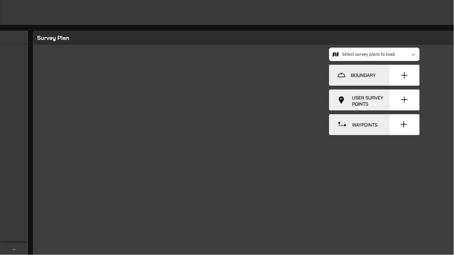
Users struggled with the complicated process of creating a survey plan from scratch on a touch screen.
Challenges
Challenging EnvironmentUsers work in extreme heat, dust, intense sunlight, and heavy personal protective equipment (PPE).
Effectiveness-DrivenUsers need to generate a plan every time after a blasting. (Time-consuming: 0.5-1 day by manually, 1.5 - 4 hr by auto).
Real-Time AdjustmentUsers may need to modify the plan based on real-time geologic conditions.
Run a cross-functional workshop to define user journey and insights
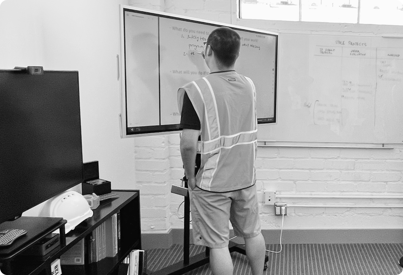
To dive deeper, I hosted a brainstorming workshop with CFOs, engineers, operators, and mining experts to learn about the workflow, red flags, and tech constraints. I analyzed the transcripts and insights and clarified typical user workflows.

1. Understood how the survey plan works.
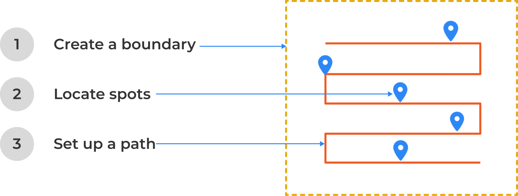
I learned that creating a Survey Plan requires three parameter values: one boundary, user survey points (must pass through), and a travel path.

2. Defined the high-level design goal.
To provide an intuitive planning experience, the HMI system should offer effective tools that enable users to easily create survey plans on a touch screen within a tough environment.
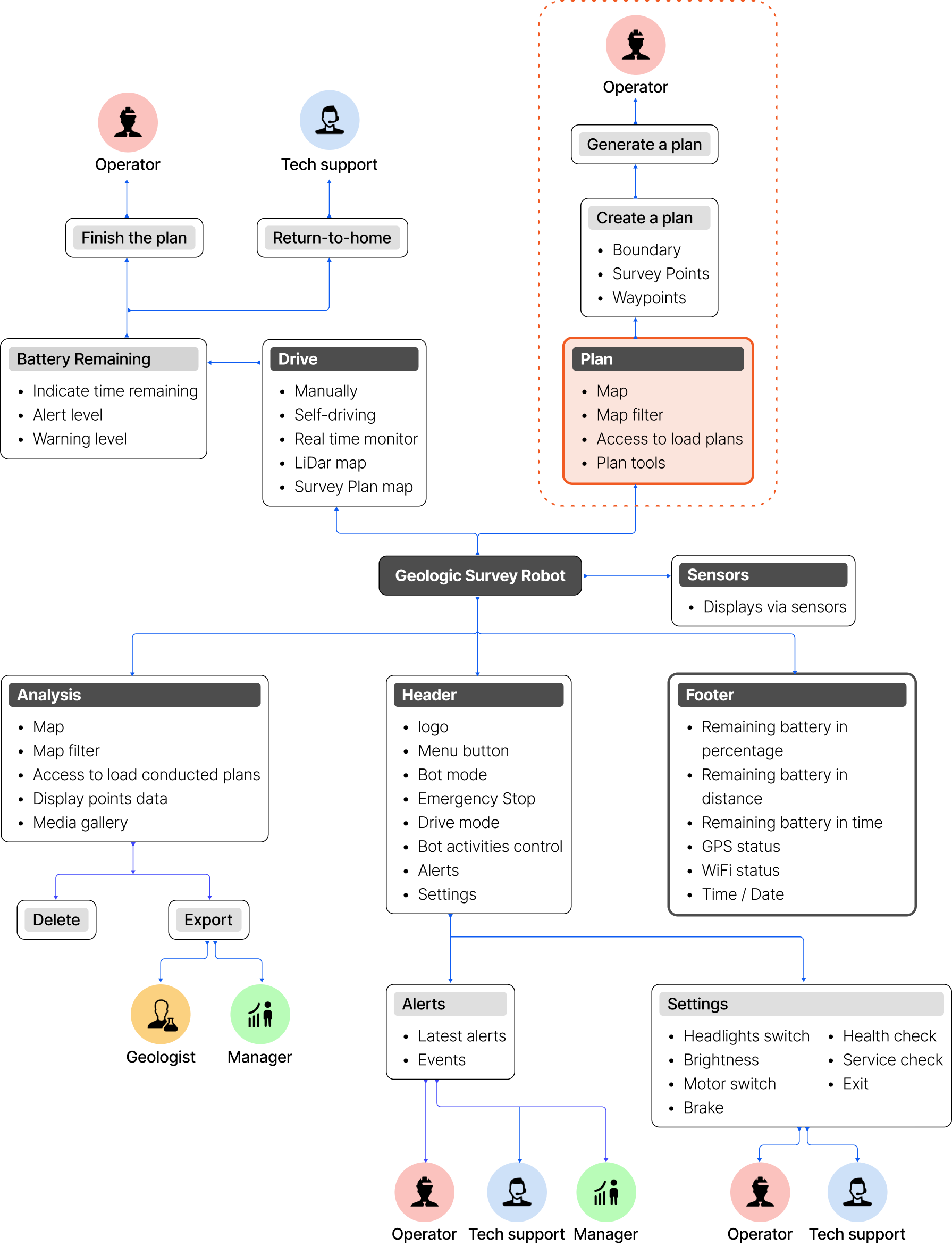
3. Proposed a new workflow.
In a start-up without a Product Manager, the team struggled to align on HMI product features. I engaged the CFO and program leads to reframe the MVP features and drove alignment by compiling the Product Requirement Document (PRD) for the MVP.

Concept development
1. Led the design process to developed the 1st tool concept through the low-fidelity wireframes.

2. To reframe the design concept, I did a usability testing to clarify the pain points.
Test goals:
Understood how the jobs were to be done in this workflow.
Learned about how the buttons, icons, and labels impact the participants’ decision-making.
Asked questions to learn about the participants’ expectations for each step.
Observed what the obstacles would impact users to take actions
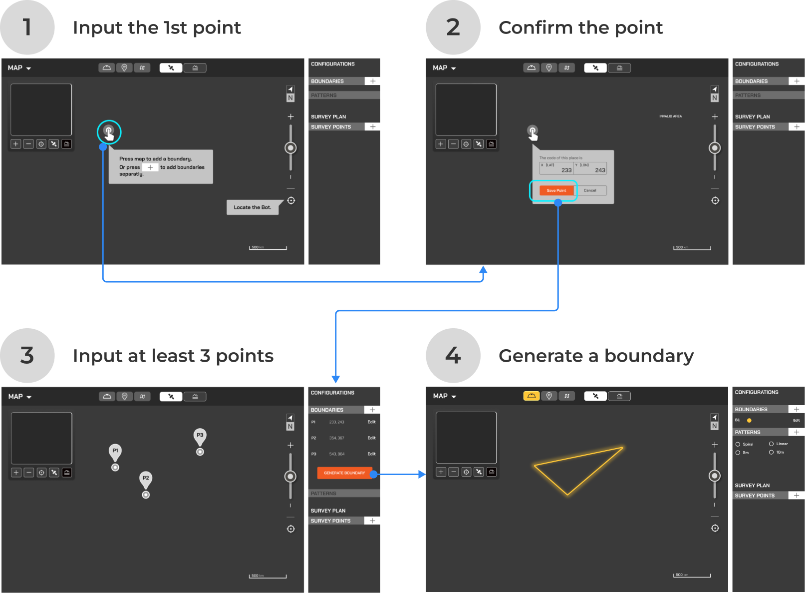
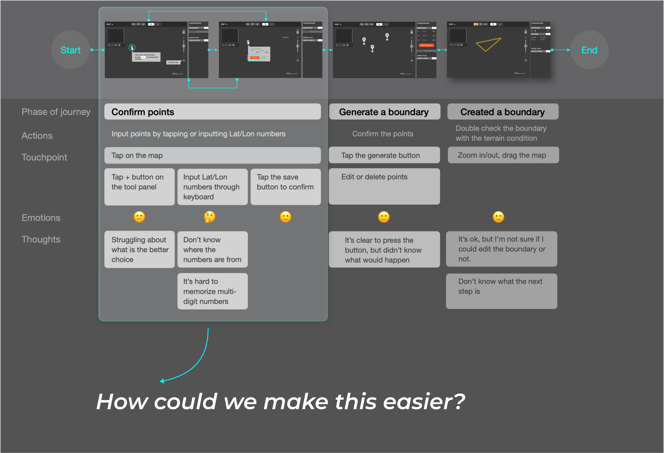
During the usability testing, I observed the most of the participants struggled to create a boundary by adding points. After the test, I created a journey map for the ‘creating a boundary’ workflow to understand the participants’ thoughts and ideated a new solution.
Summarized the findings:
The side sheet doesn’t show a clear work flows to users.
It needs too much work to create a boundary by adding points.
It needs too many steps to complete in one task.

3. Redefined the design strategies.
After the test, we realized the side sheet bar couldn’t meet users' needs. So we set up the following strategies:
Simplify or cancel the side sheet.
Provide clear workflow by keeping users focused on current parameters.
Make the tools easy-to-use.
Redefined design concept
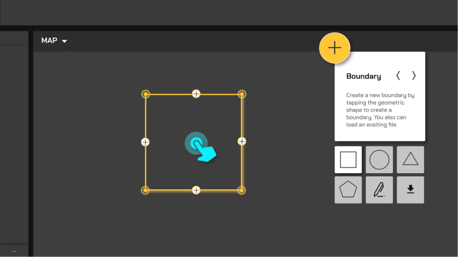
To enhance the planning experience, I proposed using floating windows instead of side sheets and provided two design concepts:
Display a single floating window with arrows to toggle parameters.
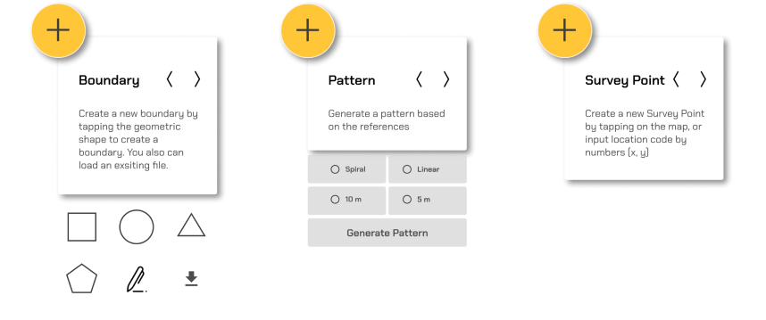
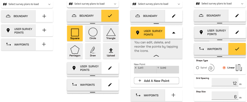
Display three floating windows that expand with tools to set up parameters.
I discussed these ideas with the small team, synthesized the pros and cons, and the team agreed on Concept 2.
Concept 1
Floating Window with toggling buttons


Toggle on the arrows to focus on one parameter.
The other two parameters have been hidden. Not friendly for new users.
Concept 2
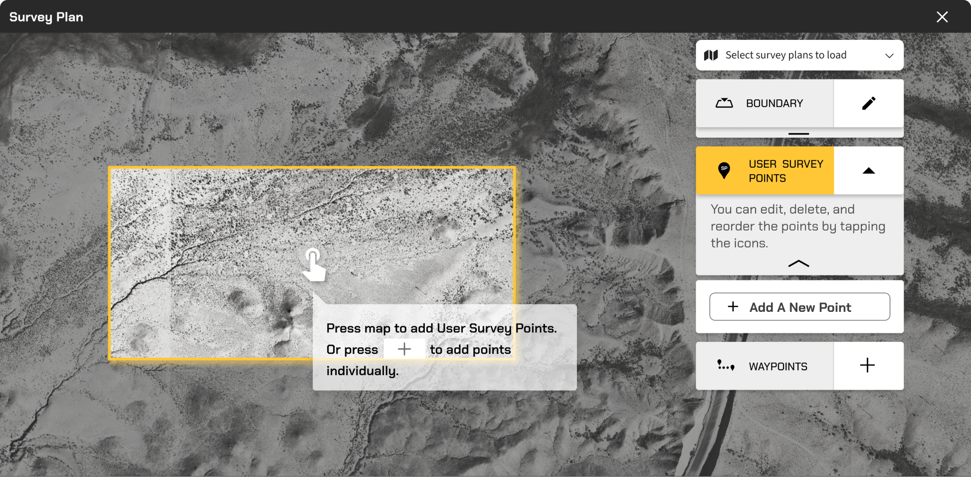
Floating windows with dropdown drawers


Three parameters will be presented at the same time.
There are fewer touchpoints and a much clearer design for users.
Concept 2 High-fidelity prototype
